PizzaV2
Cross-Platform Pizza OrderingModern pizza ordering app with phone auth, OTP verification, customizable sizes (S/M/L), real-time cart management, and order tracking with status badges. Built with React Native 0.76 and TypeScript.
Building a modern food ordering app means juggling phone auth flows, complex product customization, and real-time cart state — all while delivering a polished native feel. Most solutions feel clunky, lack proper OTP UX, and fail to handle the nuances of mobile ordering like size variants, quantity management, and order lifecycle tracking.
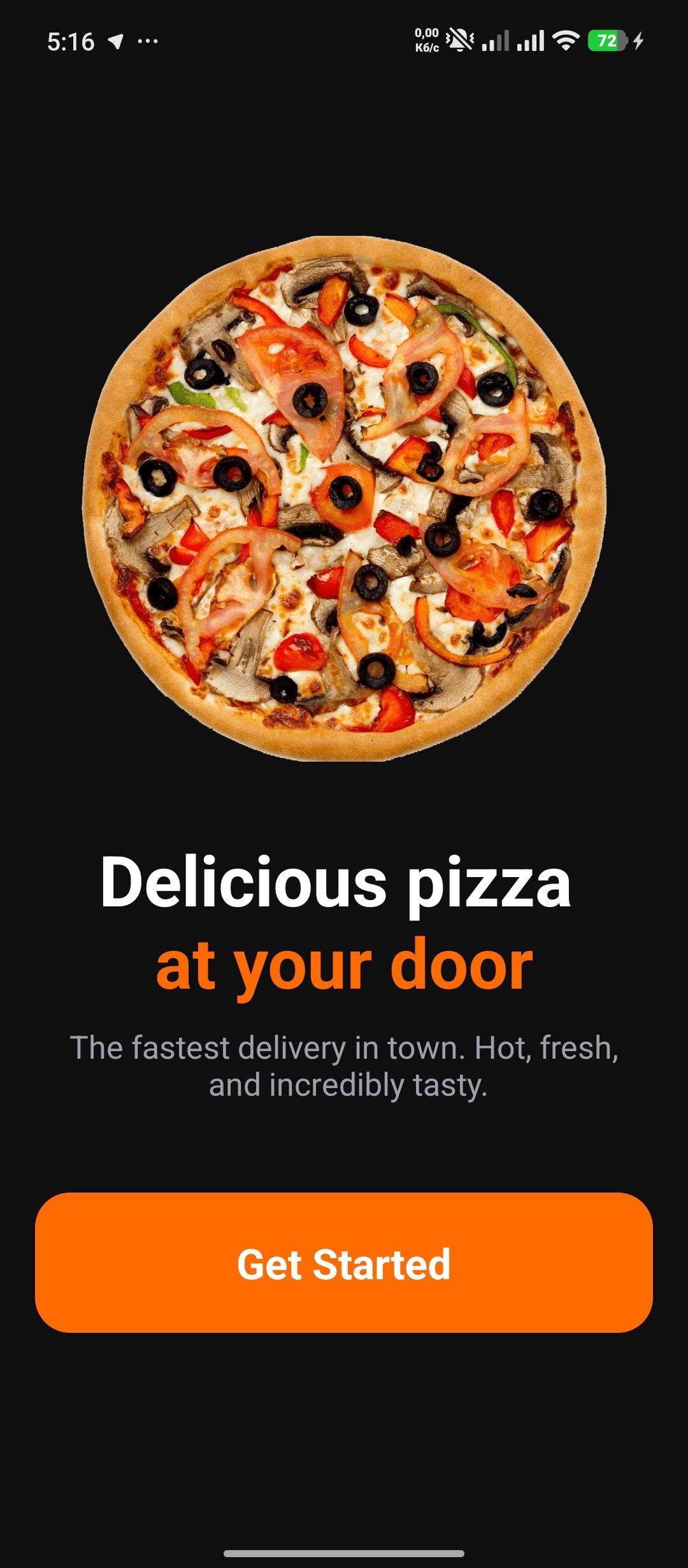
A dark-themed pizza ordering app with seamless phone authentication, OTP verification with auto-advancing inputs, a searchable catalog of 10 pizzas with S/M/L size options, real-time cart management, and full order history with status badges. Built from a single React Native CLI codebase targeting Android with Hermes engine.
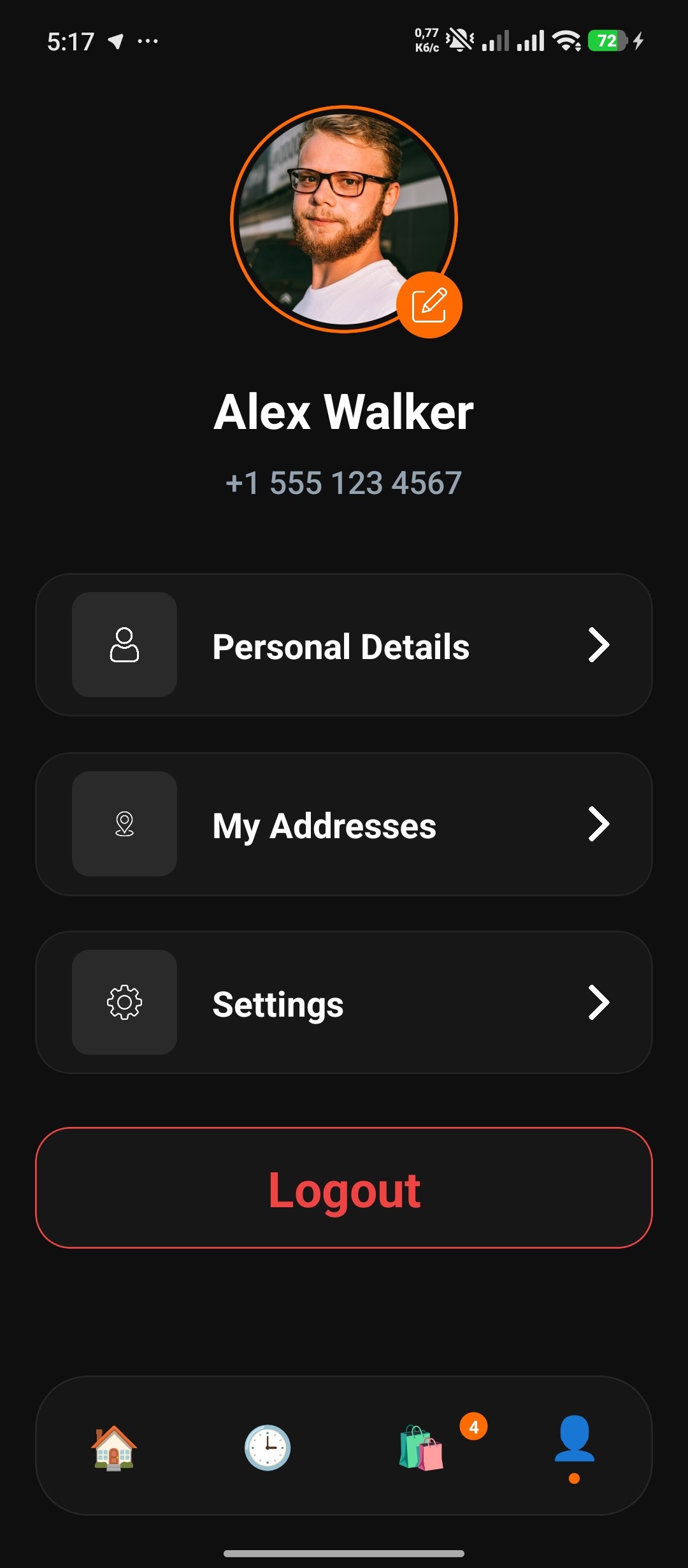
React Navigation 7 drives auth-gated routing with three navigators: `AuthNavigator` (onboarding → phone login → OTP), `TabNavigator` (home, history, cart, profile), and a nested stack for the pizza detail flow. State is managed through two React Context providers with guard-clause hooks. A fully custom `BottomNavigation` component replaces the default tab bar with emoji icons, active dot indicators, and a cart badge synced to context.
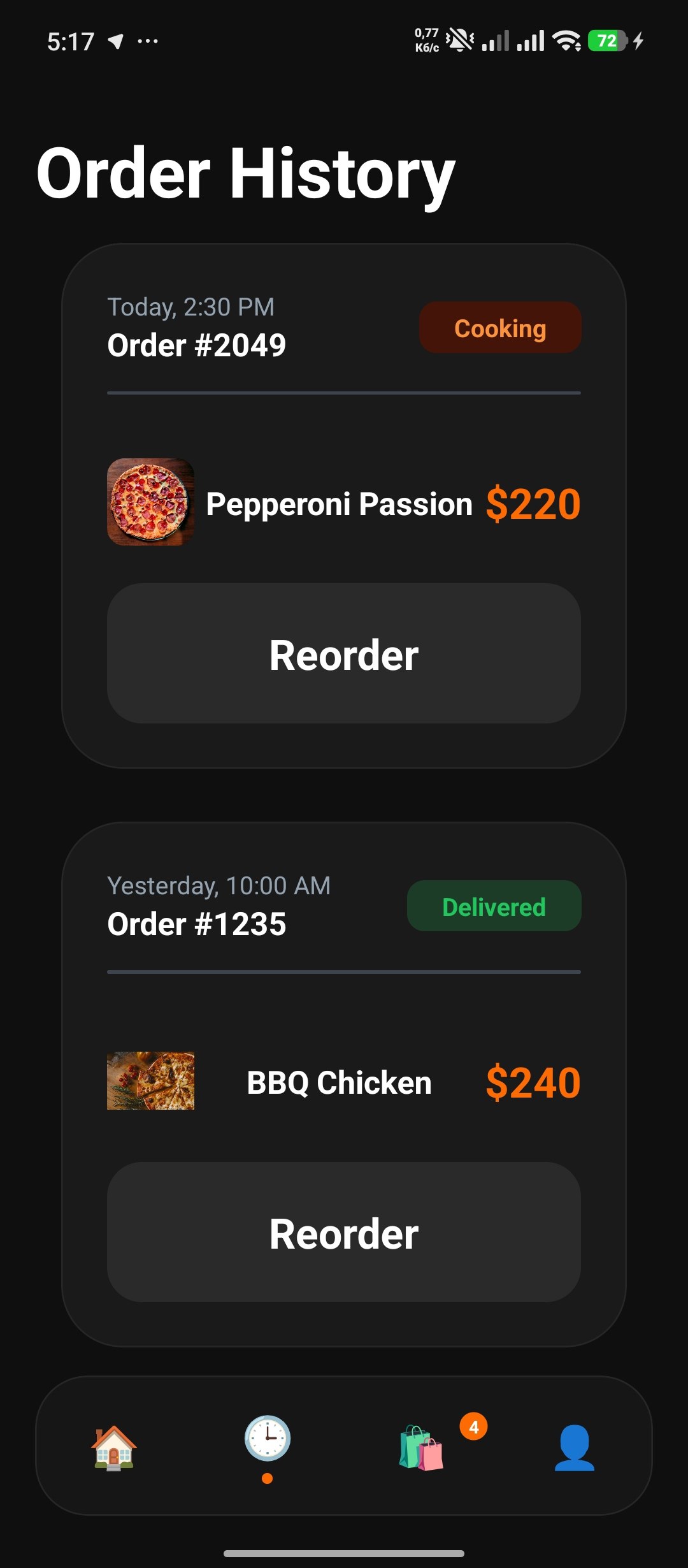
A cohesive dark design system with an orange (#FF6B03) accent, 20px border radius on cards, pill-shaped buttons, and consistent spacing tokens. Floating product images overlap cards with negative margins. Seven order status badges each have distinct color pairs — cooking (orange on dark orange), delivered (green on dark green), canceled (red on dark red) — powered by a token-based style map.
Key Features
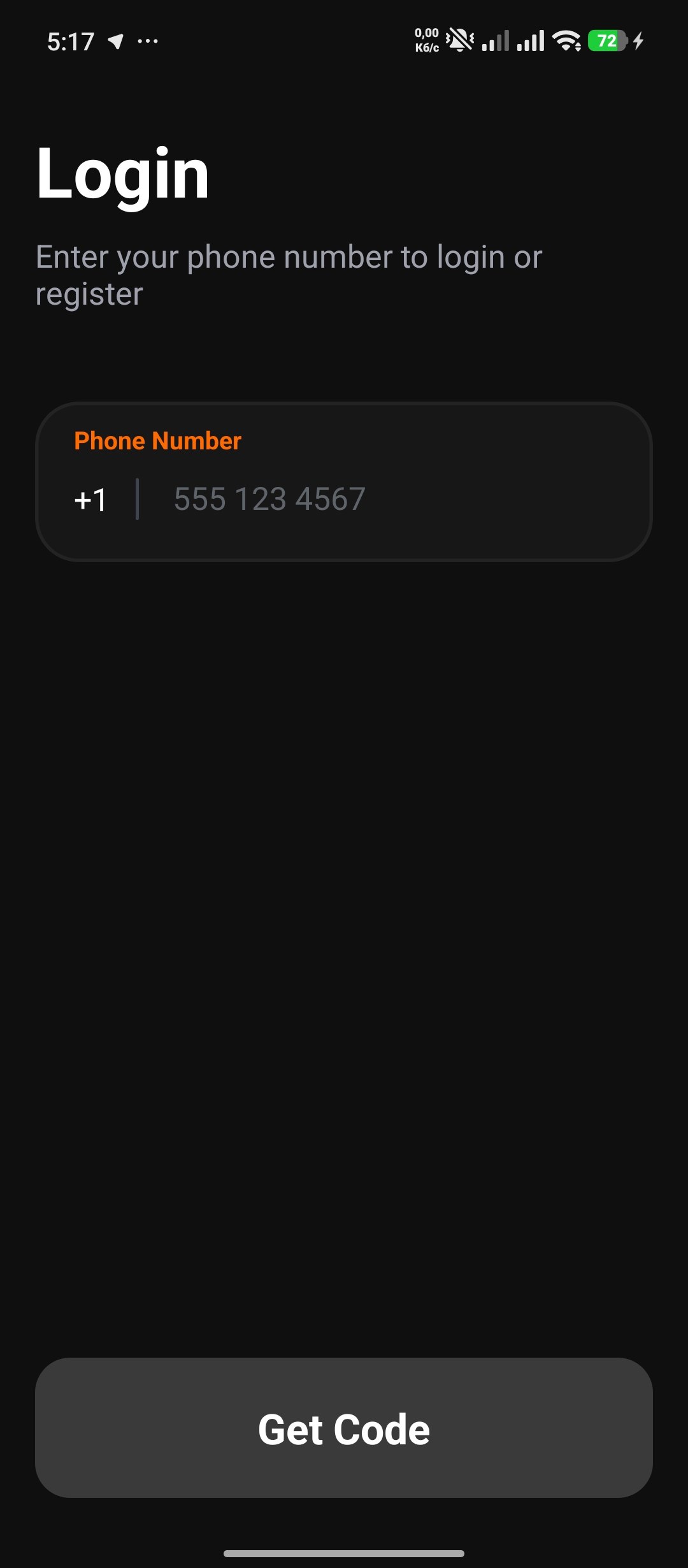
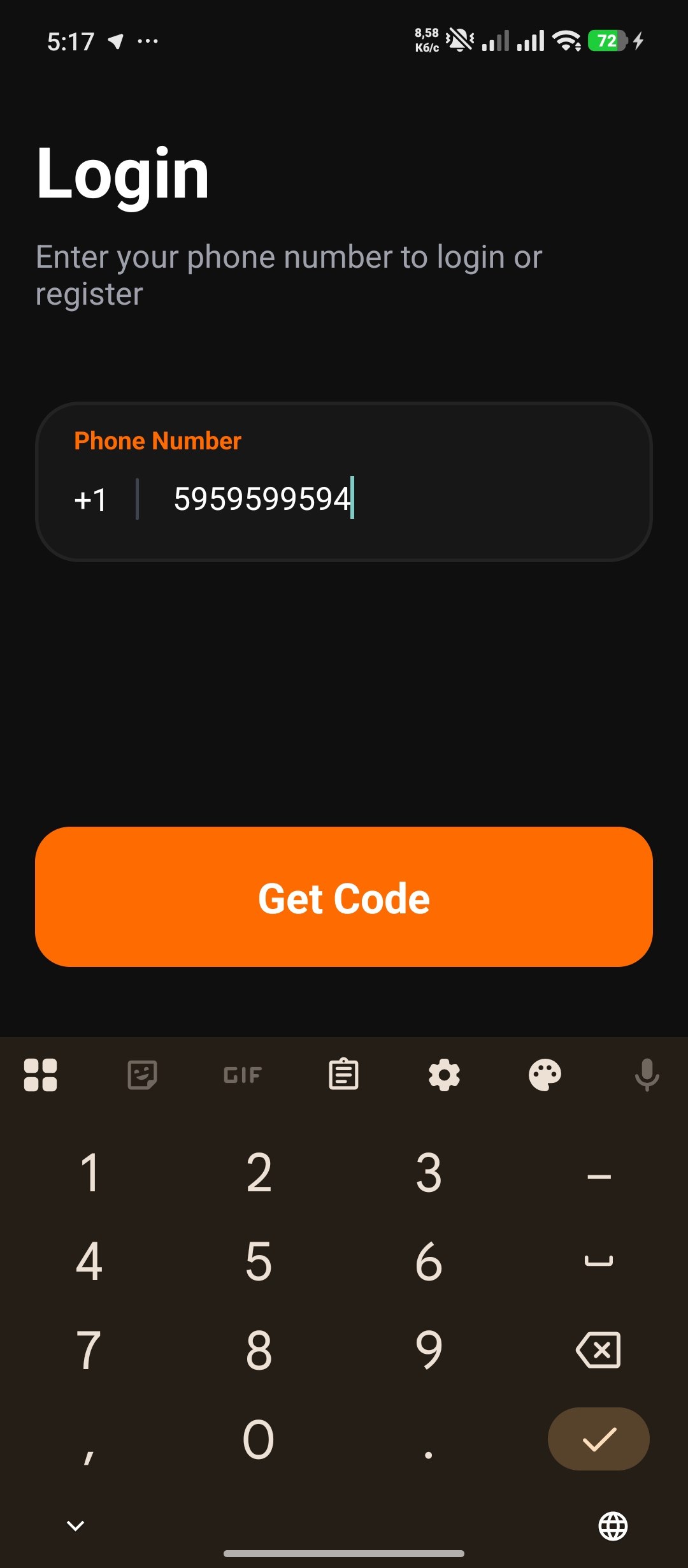
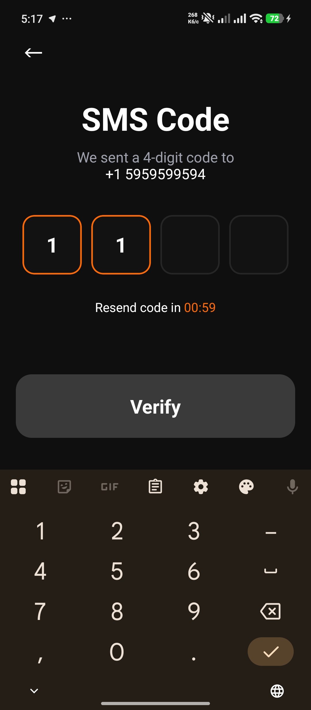
Phone Auth & OTP
Three-step auth flow: onboarding → phone entry → 4-digit OTP. Individual input boxes with auto-advance on entry and backspace rewind — matching native SMS code behavior. Dynamic button states reflect input validity.
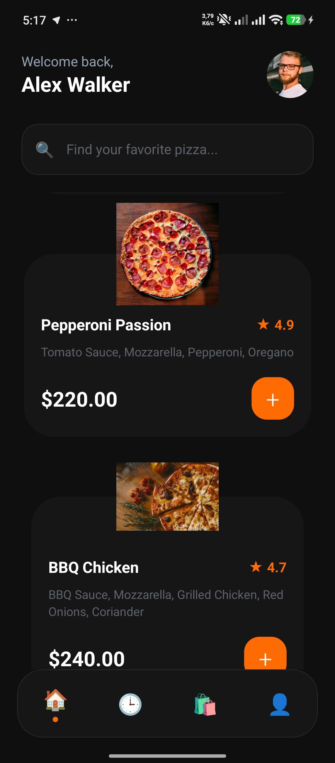
Searchable Catalog
Live search filters 10 pizzas by name or ingredient in real-time. Floating product cards with overlapping images and a "+" add-to-cart button. Empty state with friendly fallback.
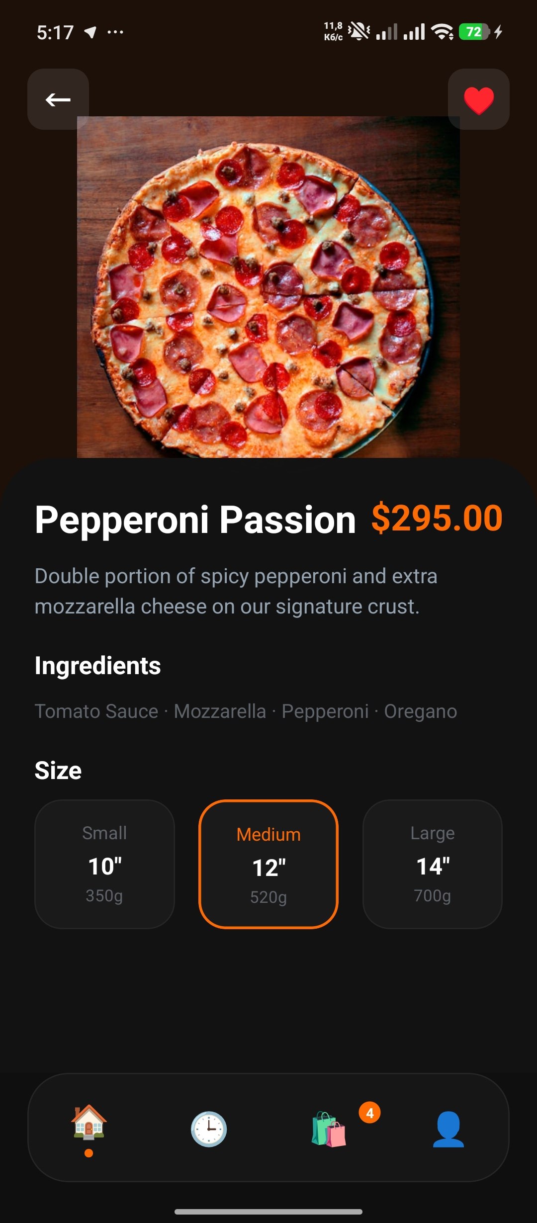
Size Customization
S/M/L size selector with weight and price per option. Medium selected by default. Quantity counter with min-1 guard. Total price derived from selected option × quantity.
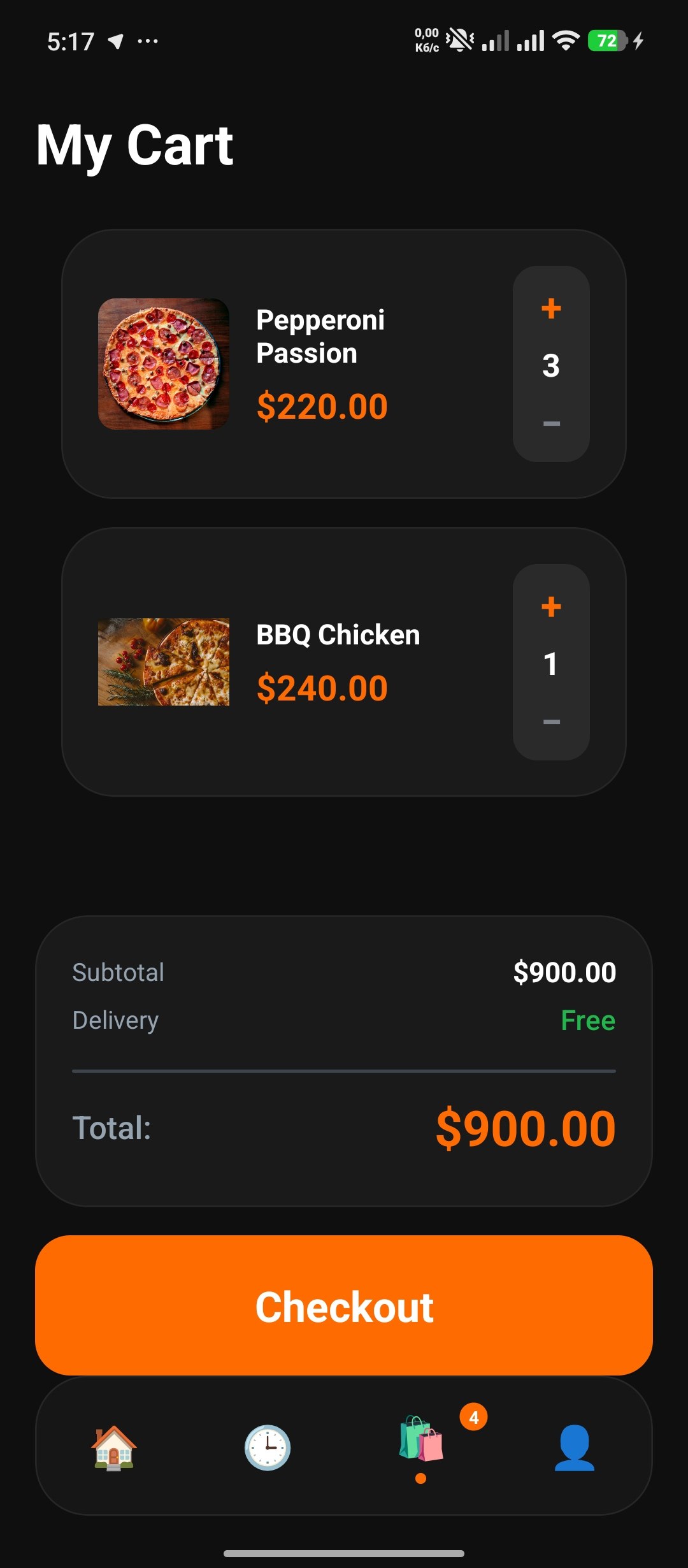
Immutable Cart
Context-driven cart with `map` + `filter` immutable update pattern. Quantity overflow auto-removes items at zero. Badge counter syncs across screens via custom tab bar. Derived `totalCount` and `totalPrice` — no stale state.
Order Status Badges
Seven-status enum (Completed, Delivered, Pending, Cooking, On the Way, Arrived, Canceled) with token-based color mapping. Each badge renders with semantic label, text color, and background — no conditional styling.
Custom Tab Bar
Full reimplementation of `BottomTabBarProps` with emoji icons, active dot indicator, and absolutely-positioned cart badge. Floating design with 30px border radius and 80px height.
Under the hood
import React, { useRef, useState } from 'react';
import {
  View, TextInput, Text, KeyboardAvoidingView,
  Platform, ScrollView, TouchableOpacity,
} from 'react-native';
import { useRoute, RouteProp } from '@react-navigation/native';
import AppButton from '../components/AppButton';
import { useAuth } from '../context/AuthContext';
import { AuthStackParamList } from '../navigation/AuthNavigator';

type Route = RouteProp<AuthStackParamList, 'OtpVerification'>;
const OTP_LENGTH = 4;

const OtpVerificationScreen = () => {
  const [otp, setOtp] = useState<string[]>(Array(OTP_LENGTH).fill(''));
  const inputs = useRef<(TextInput | null)[]>([]);
  const { login } = useAuth();
  const route = useRoute<Route>();
  const phone = route.params?.phone ?? '+1 555 123 4567';

  const handleChange = (text: string, index: number) => {
    if (text.length > 1) return;
    const newOtp = [...otp];
    newOtp[index] = text;
    setOtp(newOtp);
    if (text && index < OTP_LENGTH - 1) {
      inputs.current[index + 1]?.focus();
    }
  };

  const handleKeyPress = (e: any, index: number) => {
    if (e.nativeEvent.key === 'Backspace' && !otp[index] && index > 0) {
      inputs.current[index - 1]?.focus();
    }
  };

  const isComplete = otp.every(d => d !== '');

  return (
    <KeyboardAvoidingView
      style={{ flex: 1, backgroundColor: '#0F0F0F' }}
      behavior={Platform.OS === 'ios' ? 'padding' : 'height'}
    >
      <ScrollView
        contentContainerStyle={{
          flexGrow: 1, alignItems: 'center',
          paddingHorizontal: 20, paddingVertical: 40,
        }}
        keyboardShouldPersistTaps="handled"
      >
        <Text style={{ color: 'white', fontSize: 40, fontWeight: 'bold', marginTop: 20 }}>
          SMS Code
        </Text>
        <Text style={{ color: '#9EA1AB', fontSize: 18, marginTop: 10, textAlign: 'center' }}>
          We sent a 4-digit code to {'\n'}
          <Text style={{ color: 'white' }}>{phone}</Text>
        </Text>

        <View style={{ flexDirection: 'row', gap: 12, marginTop: 40, marginBottom: 20 }}>
          {otp.map((digit, index) => (
            <TextInput
              key={index}
              ref={ref => (inputs.current[index] = ref)}
              style={{
                width: 75, height: 75, backgroundColor: '#121212',
                borderRadius: 15, borderWidth: 2,
                borderColor: digit ? '#FF6B00' : '#262626',
                fontSize: 26, fontWeight: 'bold', color: 'white',
                textAlign: 'center',
              }}
              value={digit}
              onChangeText={text => handleChange(text, index)}
              onKeyPress={e => handleKeyPress(e, index)}
              keyboardType="numeric"
              maxLength={1}
              selectionColor="#FF6B00"
              caretHidden
            />
          ))}
        </View>

        <View style={{ flex: 1, minHeight: 40 }} />

        <AppButton
          onPress={login}
          title="Verify"
          containerColor={isComplete ? '#FF6B00' : '#3A3A3A'}
          contentColor="white"
        />
      </ScrollView>
    </KeyboardAvoidingView>
  );
};
Gallery
Want to see more?
Explore the full project catalog or grab the source code.